Re-Branding
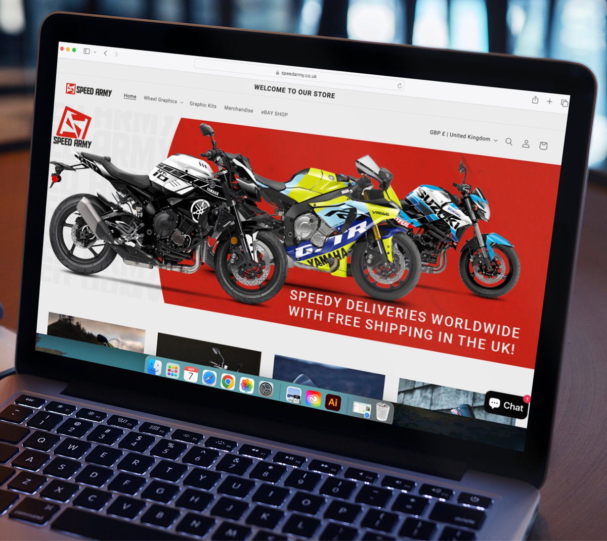
The project was to rebrand Speed Army by creating a new logo. The old logo had too many thin lines, which made it hard to see the details from a distance or when zoomed out. The task also included choosing a set of brand colours that would look good both digitally and in print. Additionally, the logo needed to have both a portrait and a landscape version.
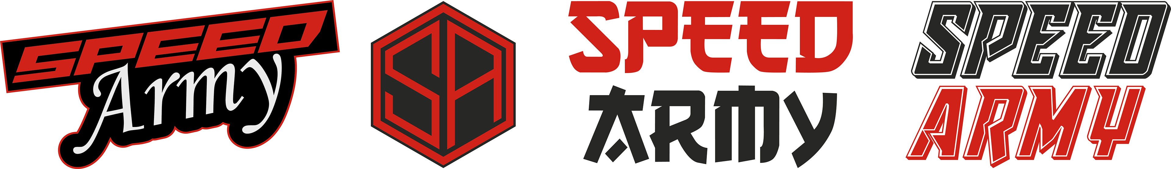
Old Logo Variations
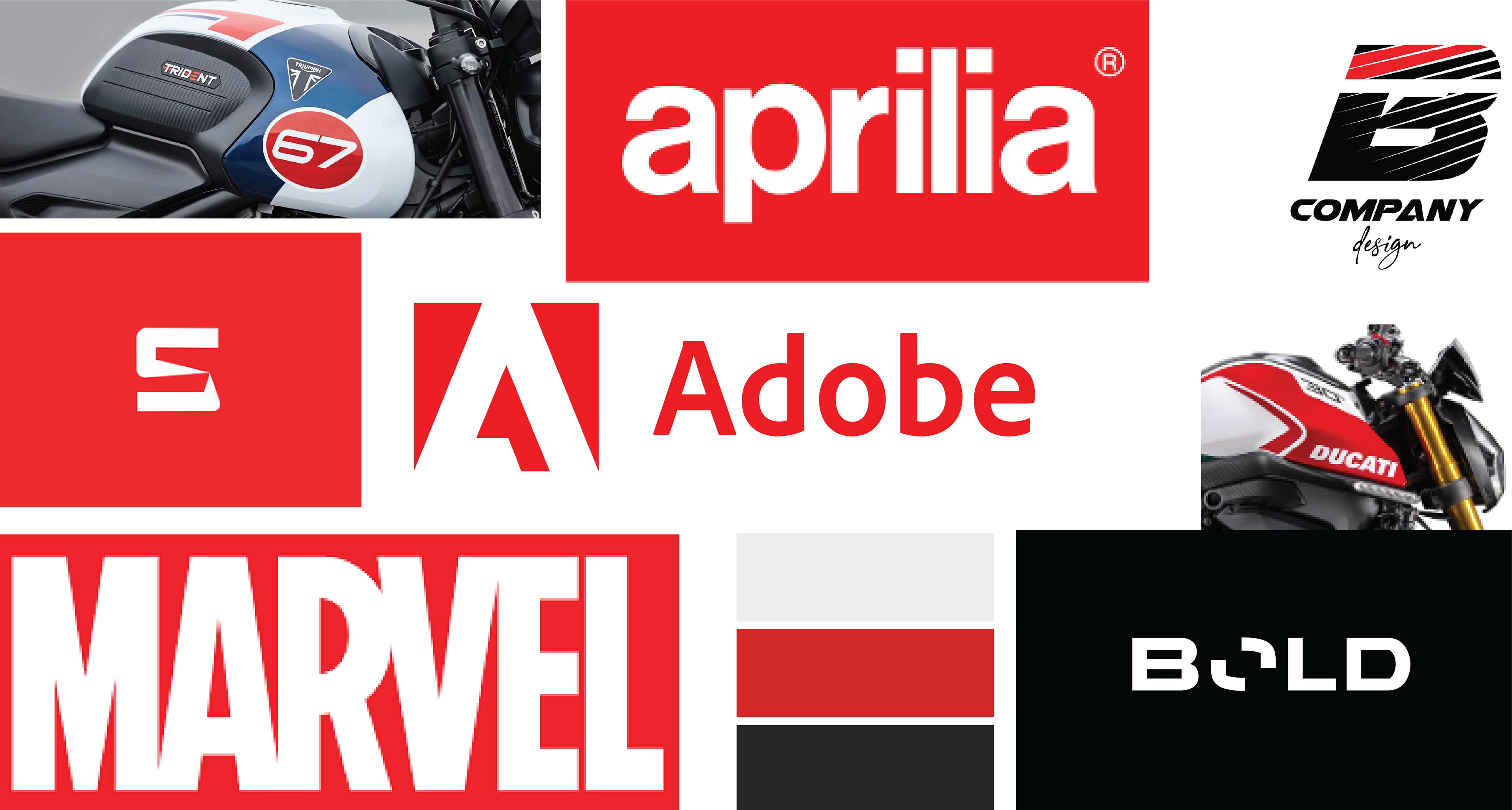
Moodboard
Colours
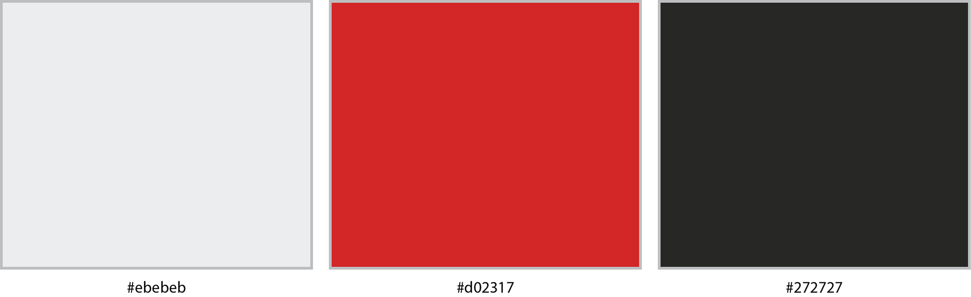
For the colours, I aimed to maintain a similar palette but slightly modify it for a fresher look. The original colours were black, white, and red. I've now muted these shades to provide a softer contrast, enhancing the overall visual appeal while keeping the brand's identity recognizable.
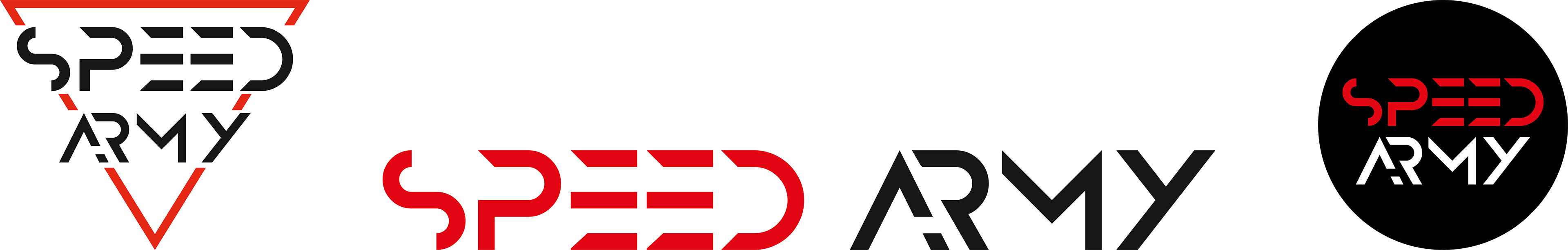
Logo Ideas
logo concept
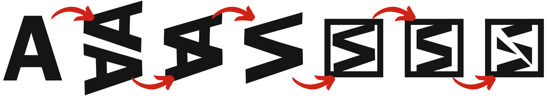

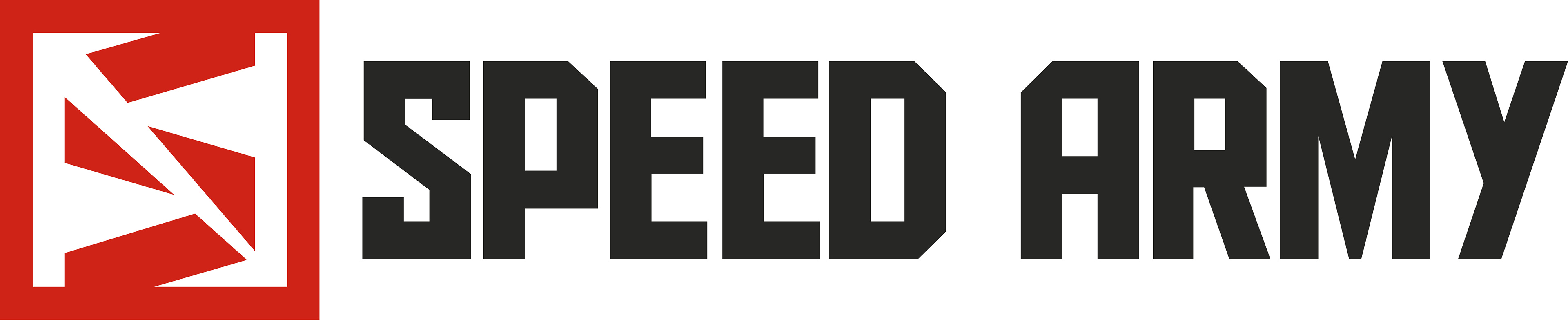
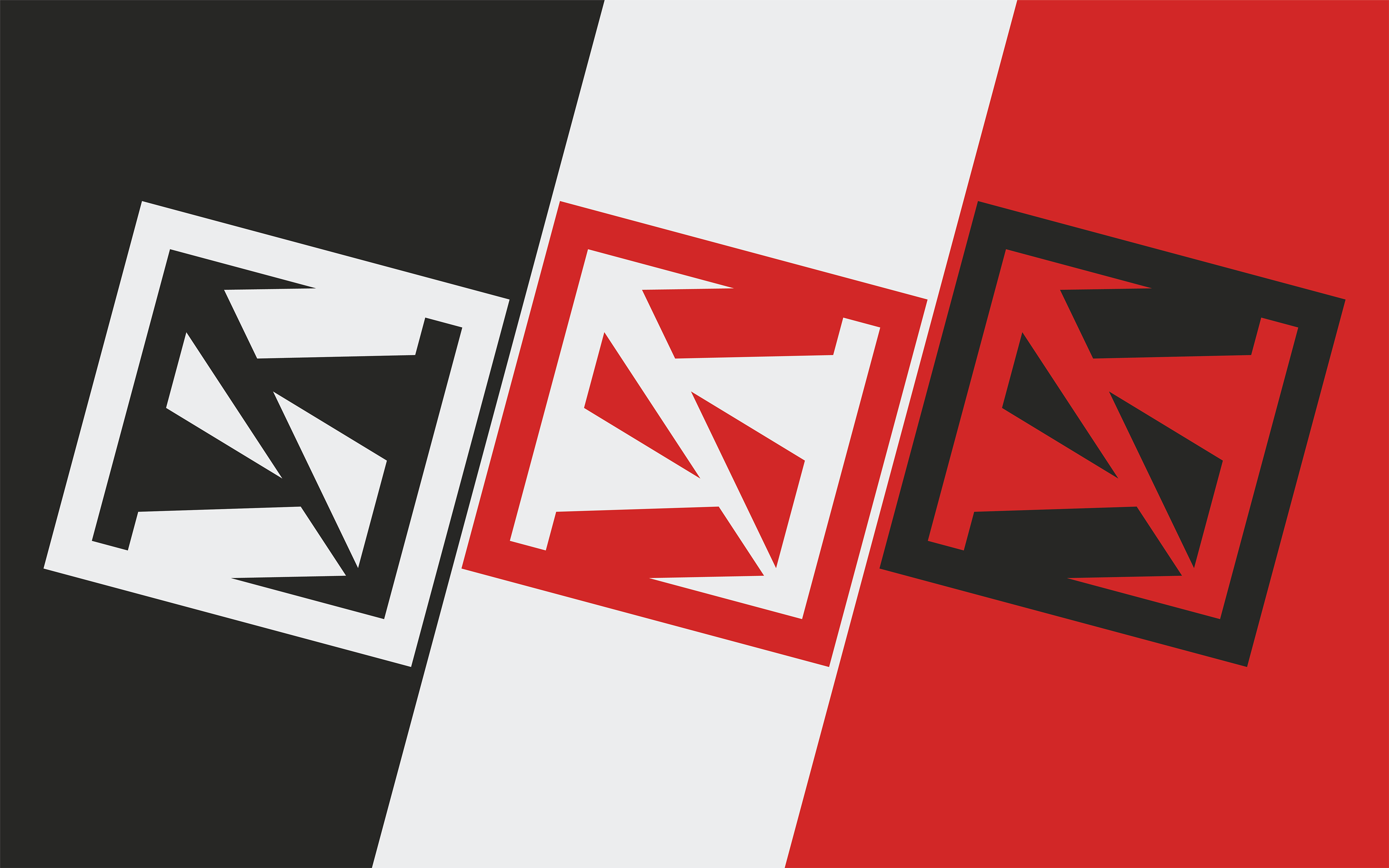
The final logo concept began by merging two 'A' letters to form the letter 'S'. After refining the design to enhance its appearance, I added a square frame around the logo to make it stand out when viewed independently. To further enrich the logo's iconography, I incorporated a slash through the 'S', symbolizing a cut typically made by a scalpel—this element nods to the vinyl decal industry where a scalpel is a crucial tool. Next, I selected a bold font with sharp corners for its strong appearance. However, to make it more visually appealing and approachable, I modified the font by softening the edges and reducing the number of sharp angles.
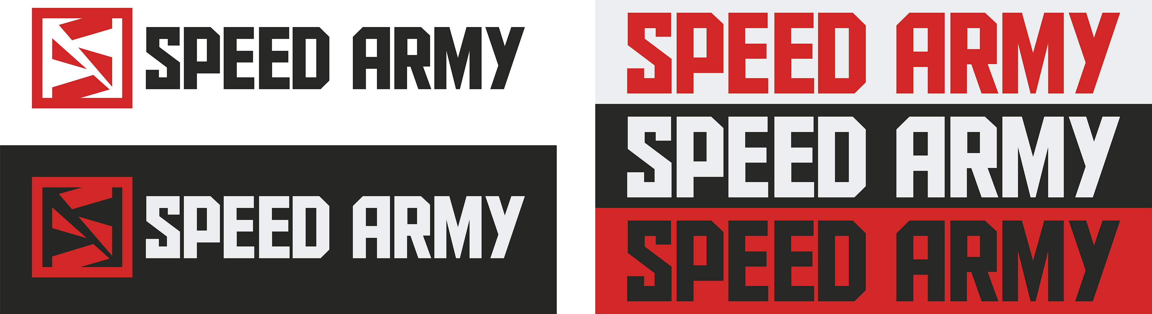
Logo Variations

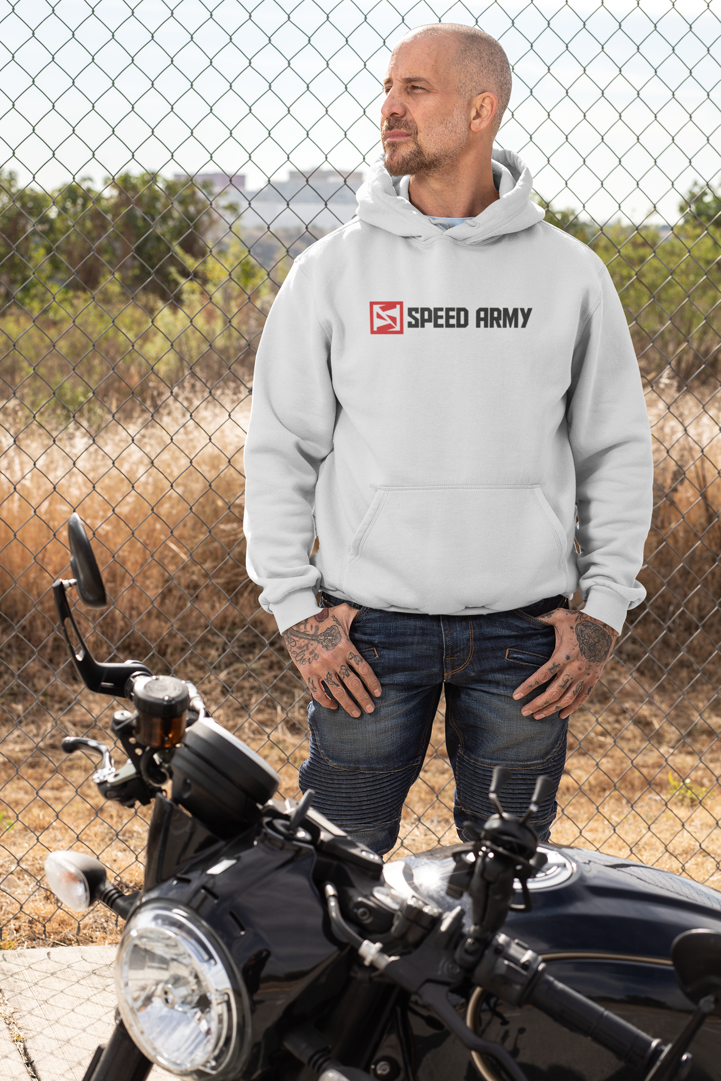
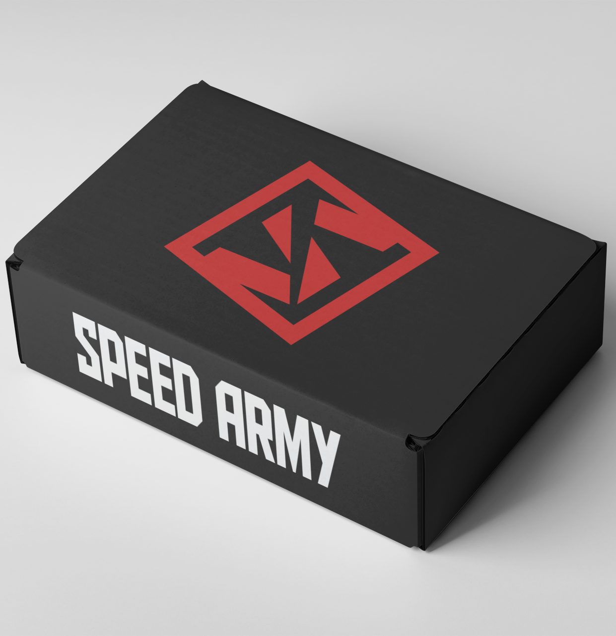
Logo Usage

Do Not